

How to Group Decorative Bells for Visual Impact
Learn how to arrange decorative bells by height, finish, and texture to build balanced, intentional displays on shelves, tables, and mantels.

Decorative bells rarely make a strong impression on their own. A single brass bell on a side table can look lonely; a row of them lined up like soldiers can look like inventory rather than decoration. The difference between a collection that feels curated and one that feels cluttered usually comes down to grouping. Height, finish, and texture do most of the work, and a few deliberate decisions about spacing will finish the job.
The good news is that bells are forgiving objects to style. They come in varied silhouettes, they reflect light, and they carry enough visual weight to anchor a small arrangement without dominating a room. Whether you have three bells or thirty, the same principles apply. Here is how to put them together so the display reads as one considered composition.
Start With Height: Build a Triangle, Not a Fence
The most common mistake in bell arrangements is placing everything at the same level. A straight line of similar-sized bells creates a fence across your shelf, and the eye has nothing to follow. Instead, aim for a triangular silhouette: the tallest piece near one side or slightly off-centre, stepping down to the smallest at the opposite end.
If your bells vary in height, this happens almost naturally. Place the tallest bell at the back of the group and let the shorter ones move forward and outward. If your bells are similar in size, create height difference with risers. A small stack of two hardback books, a shallow wooden bowl turned upside down, or a stone coaster will lift a bell just enough to break the line. Even two centimetres of elevation is visible from across a room.
Working with matched sets
A set of bells in graduated sizes is a gift for styling, but resist the urge to arrange them strictly from tallest to shortest like a shop display. Try placing the largest in the middle and letting the smaller ones step down on either side. Or break the set entirely: put two bells together on the shelf and the third on a nearby table, so the collection feels spread through the room rather than confined to one spot.
Balance Finishes Rather Than Matching Them
Finish is where many arrangements go wrong in the other direction. Matching every bell in the same brass tone can look flat, while mixing five different metals with no logic can look accidental. The middle ground is to choose a dominant finish and let one or two contrasting pieces play against it.
As a rule of thumb, keep roughly two-thirds of the group in the same family — aged brass, for example — and introduce contrast with the remainder. A single dark bronze or matte black bell among warm golden ones will read as intentional. Two shiny silver bells in a group of patinated copper will do the same.
- Warm with warm: brass, copper, and bronze sit comfortably together; vary the patina rather than the metal.
- One cool note: a single pewter or nickel bell adds crispness to a warm-toned group.
- Matte as a buffer: if two shiny finishes compete, place a matte or painted bell between them to separate the reflections.
- Repeat, don't scatter: if you use a contrasting finish, use it at least twice in a larger arrangement so it looks like a choice.
Light matters here too. Bells placed near a window will throw highlights across a shelf; polished finishes can become almost too bright in direct sun, while patinated and matte finishes hold their shape. If a shelf catches strong afternoon light, lean toward brushed and aged surfaces and save the high shine for a dimmer corner.
Use Texture to Give the Eye Somewhere to Rest
Texture is the quiet member of the trio, but it is what stops a display from looking like a catalogue photograph. Smooth cast bells, hammered surfaces, turned wooden handles, woven cord, leather loops, and rough ceramic bodies all read differently at a glance. A group with only smooth, glossy pieces can feel clinical; a group with too many rough, busy surfaces can feel noisy.
A practical approach is to assign each bell a role. Most of the group should be mid-texture — smooth but not mirror-like. Then add one piece with visible hammer marks or a grainy cast surface, and one with a soft element such as a fabric ribbon or a leather strap. That soft note is especially useful when your bells sit among books, ceramics, or stone, which are all hard materials.
Texture as a bridge
Bells grouped with other objects need a visual connection. A wooden-handled bell next to a wooden picture frame ties two zones together. A bell with a woven cord beside a rattan tray does the same. Look at what is already on the shelf and let one bell echo it.
Compose in Odd Numbers, Then Adjust
Odd numbers of objects tend to feel more natural to the eye because they resist symmetry. Three, five, or seven bells in a group usually read better than four or six. That said, the rule is a starting point, not a law. If you have a pair of matching bells you love, use them as a pair deliberately, flanking a taller object, and the symmetry will look like a decision rather than an accident.
When you have more than five bells, resist putting them all in one cluster. Break the collection into a main group and a smaller satellite group on the same shelf or an adjacent surface. A trio at one end of a console and a pair at the other, with open space between, will look more composed than a dense row of eight.
Get the Spacing and Depth Right
Spacing is the detail most people skip. Bells should be close enough to read as a group but far enough apart that each silhouette is clear — usually a gap of roughly half a bell's width. If two bells touch, they merge into one shape.
Depth matters on deeper shelves. Pull one bell forward so it sits closer to the shelf edge than the rest, and push another back toward the wall. This creates a small sense of layers and stops the arrangement looking like a row of cut-outs. On a narrow mantel or a shallow ledge, stay in a single plane and rely on height instead.
- Clear the surface completely and place the tallest bell first.
- Add the second tallest at a diagonal, not directly beside it.
- Fill the middle with a mid-sized bell, leaving a gap of about half its width on each side.
- Bring one small bell forward for depth.
- Step back three paces and check the silhouette — adjust before adding anything else.
- Only then add the final contrasts in finish and texture.
Common Groupings That Work
Three bells on a console table
Use one tall bell at the back left, a medium bell slightly forward and right of it, and a small bell close to the front edge. Keep the dominant finish consistent and let the smallest bell be the contrasting one.
Five bells on a bookshelf
Anchor the group at one end of a shelf rather than centring it. Place the tallest at the outer edge, step down toward the books, and allow one bell to sit in front of the row for depth. Leave the neighbouring shelf sparser so the grouping has room to breathe.
A pair on a bedside table
Two bells of different heights, one matte and one polished, placed side by side with a small gap. Simple, quiet, and enough to give a small surface a focal point.
Practical Notes Before You Finish
Dust the shelf before you style it, and wipe each bell — fingerprints show on polished surfaces and dull a good arrangement fast. Check that every bell stands securely; bells with curved or uneven bases may need a small ring of museum putty to stop them wobbling when a door closes.
Keep the arrangement away from the edges of high shelves and out of reach of young children, since heavier bells can topple. If a bell has a clapper, a tiny piece of felt inside will keep it quiet in a draughty spot without changing how it looks.
Finally, photograph your finished display on your phone. The camera flattens a scene in a useful way and makes imbalances obvious — a gap that feels fine in person often shows up clearly on screen. Rearrange, step back, and repeat until the group feels settled. Then leave it alone for a week before deciding whether it needs anything more. Most arrangements improve once the urge to keep adding has passed.
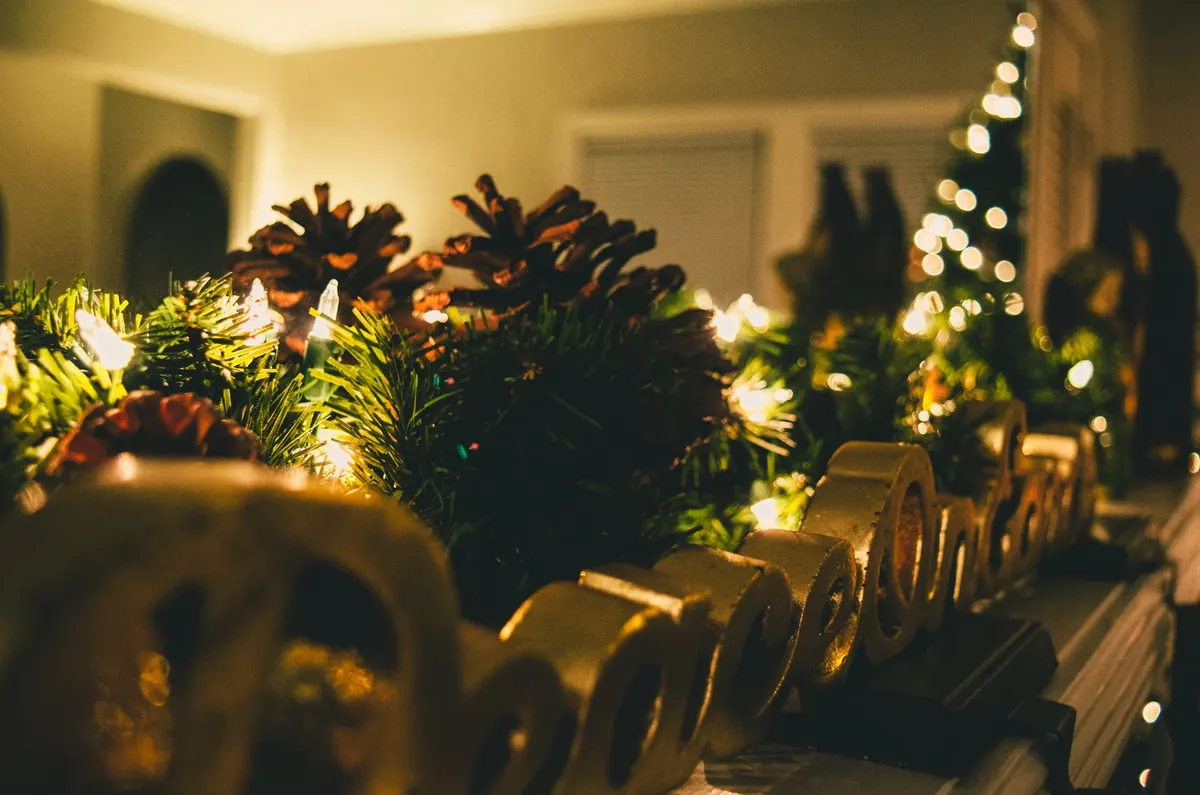
Photo: JamesDeMers / Pixabay